Trulia
Neighborly brand identity
Design Studio SF
Creative Director
Ty Whittington
Design Director
Andre Coelho
Designers
ChingFa Lung
Duy Dao
Motion Designer
Roberto Warner
Role Iconography Development
User Interface Design
Application Design
I had the privilege of working on this project during my internship at DesignStudio. My primary responsibilities included developing an iconography system and prototyping a user interface aligned with the brand’s visual language.
Under the guidance of Design Director Andre Coelho, I participated in client meetings and collaborated closely with the client’s product designer. The refreshed Trulia brand identity, centered on a neighborly aesthetic, was launched online in June 2019.
When Trulia was founded in 2005, they revolutionized the way people found homes by making real estate listings available on the internet. After nearly 15 years of improving the home-buying and renting experience, Trulia announced a new mission: “Building a more neighborly world by helping you discover a place you’ll love to live.”
We were brought in to develop a brand system that would truly express this mission. Trulia believes that the more we love where we live, the more connected we are to our communities and to each other.
When it comes to finding a home, what’s outside the front door is just as important as what’s behind it. By going beyond typical listing details, sourcing insights from locals, and offering neighborhood map overlays, Trulia gives people a deeper understanding of what living in a home and neighborhood is really like.
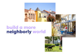
Visually dynamic, from expressive to functional
We set out to shape a dynamic identity around the new brand strategy and values. We created a vibrant visual language inspired by map iconography and neighborhood geographies.
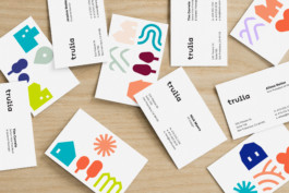
We designed bold, simple, and unique icons that evoke a charming quirkiness. The identity represents this diversity of dwellings, environments and amenities with a wide set of icons from highly functional to ultra expressive.
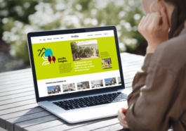
Echoing the diversity around us
When creating a custom logo we wanted to represent the unique stories and personality that Trulia embodies, designing a wordmark logo that communicates the brand name confidently and distinctly. Custom characters echo the diversity found in Trulia's neighborhoods.
We paired the logo with an app icon to let the brand further go beyond the house. The wordmark and app icon interact playfully in motion, solidifying what Trulia is all about.

Giving people a way to express their love for their communities
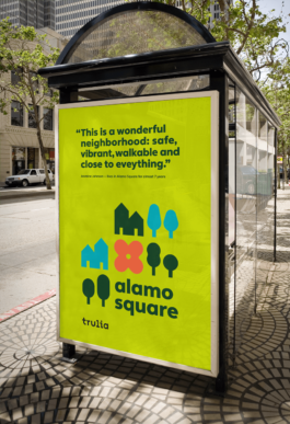
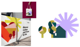
Neighborhoods are made of many parts brought together in unique compositions. The suite of icons can be used as a tool for storytelling, giving residents a way to share what they love about living in their neighborhood. In even more expressive ways they can also be used as patterns, collages or frames for textures, illustrations and photos so as to always stay fresh.
We defined tone of voice principles for Trulia to further communicate their confident, friendly and optimistic approach.
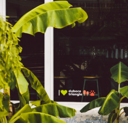
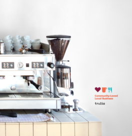
Building a world around neighborhoods
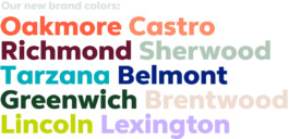
As part of the new brand identity, we developed an extensive color palette — from warm to fresh, and rich to neutral. These palette reflects the diversity found in Trulia’s communities and helps express the welcoming spirit of the brand. Each color has its own personality with custom names derived from famous neighborhoods across America. Beyond color, the identity system as a whole was designed to represent the uniqueness we each cherish about our neighborhoods.
The visual identity pairs seamlessly with Trulia’s custom designed font, Trulia Sans by Fontsmith. The fresh clean font presents boldly in color as well as in combination with iconography.
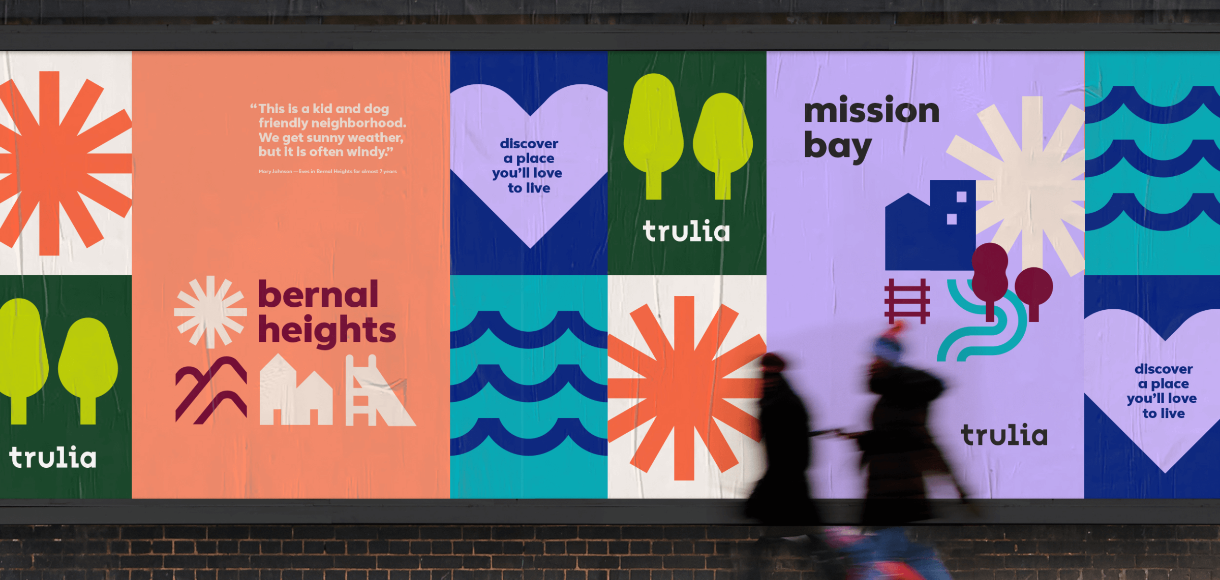
Trulia neighborly brand identity
Identity development, UI/UX
Creative Director: Ty Whittington
Design Director: Andre Coelho
Designers: Ching Fa Lung, Duy Dao
Motion Designer: Roberto Warner
I had the honor of working on this project while I was interning at DesignStudio. My primary duty included developing an iconography graphic system, and prototyping user interface with the primary brand visual language. By mainly guided with design director Andre Coelho, I had the chance to join the client team meetings and collaborate with the client's side product designer. The new Trulia neighborly brand identity was publicized online in June 2019.
When Trulia was founded in 2005, they revolutionized the way people found homes by making real estate listings available on the internet. After nearly 15 years of improving the home buying and renting experience, Trulia announced a new mission: “Building a more neighborly world by helping you discover a place you’ll love to live.”
We were brought in to develop a brand system that would truly express this mission. Trulia believes that the more we love where we live, the more connected we are to our communities and to each other.
When it comes to finding a home, what’s outside the front door is just as important as what’s behind it. By going beyond typical listing details, sourcing insights from locals and offering neighborhood map overlays, Trulia gives people a deeper understanding of what living in a home and neighborhood is really like.

Visually dynamic, from expressive to functional
We set out to shape a dynamic identity around the new brand strategy and values. We created a vibrant visual language inspired by map iconography and neighborhood geographies.
We designed bold, simple, and unique icons that evoke a charming quirkiness. The identity represents this diversity of dwellings, environments and amenities with a wide set of icons from highly functional to ultra expressive.

Echoing the diversity around us
When creating a custom logo we wanted to represent the unique stories and personality that Trulia embodies, designing a wordmark logo that communicates the brand name confidently and distinctly. Custom characters echo the diversity found in Trulia's neighborhoods.
We paired the logo with an app icon to let the brand further go beyond the house. The wordmark and app icon interact playfully in motion, solidifying what Trulia is all about.

Giving people a way to express their love for their communities
Neighborhoods are made of many parts brought together in unique compositions. The suite of icons can be used as a tool for storytelling, giving residents a way to share what they love about living in their neighborhood. In even more expressive ways they can also be used as patterns, collages or frames for textures, illustrations and photos so as to always stay fresh.
We defined tone of voice principles for Trulia to further communicate their confident, friendly and optimistic approach.


Building a world around neighborhoods
As part of the new brand identity, we developed an extensive color palette — from warm to fresh, and rich to neutral. These palette reflects the diversity found in Trulia’s communities and helps express the welcoming spirit of the brand. Each color has its own personality with custom names derived from famous neighborhoods across America. Beyond color, the identity system as a whole was designed to represent the uniqueness we each cherish about our neighborhoods.
The visual identity pairs seamlessly with Trulia’s custom designed font, Trulia Sans by Fontsmith. The fresh clean font presents boldly in color as well as in combination with iconography.


Copyright©2019-2025 ChingFa Lung - All Rights Reserved
Copyright©2019-2025 ChingFa Lung - All Rights Reserved